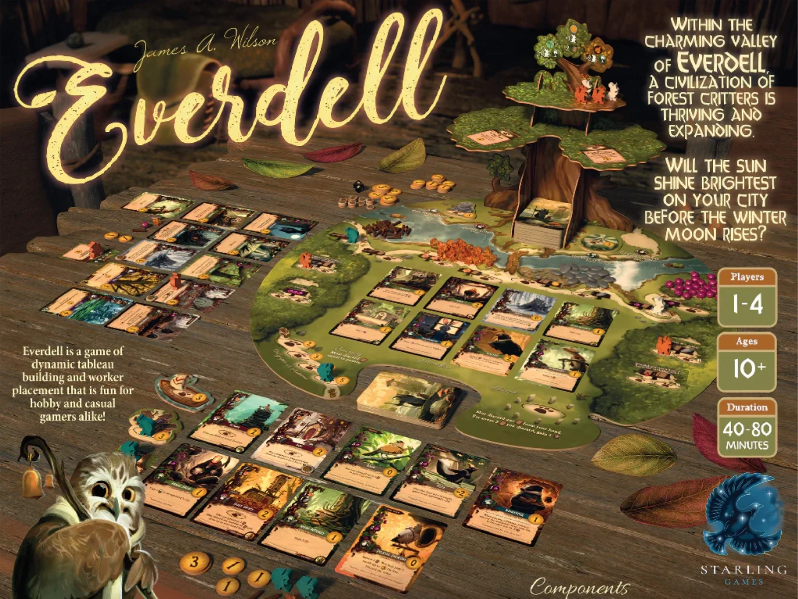
Everdell

Role
UI/UX Designer
Client
Dire Wolf
Timeline
May 2021 - July 2022
Overview
Everdell is known for its charm, dense resource engine-building, and a wide variety of cards that interact in complex ways. My role on the digital Everdell project was to create an interface that captures the warmth of Everdell’s world while helping players quickly understand and manage intricate card synergies, turn sequences, and resource flows. The goal was to deliver an experience that feels whimsical and approachable without sacrificing clarity or strategic depth.
The Problem
Complex Systems in a Thematic Interface
Everdell appears gentle on the surface, but its gameplay is surprisingly intricate. Players must simultaneously track:
Multiple resource types (twigs, resin, pebbles, berries)
Worker placement locations that open and close across seasons
Dozens of unique cards with conditional abilities
City tableau synergies and scoring combos
On a small screen, this complexity leads to a series of challenges:
Card text can overwhelm the interface
Important info competes visually with Everdell’s art
Players need frequent access to both their tableau and the shared board
Managing seasonal transitions can feel confusing without clear cues
The goal was to simplify the cognitive load while reinforcing the cozy, illustrated world that defines Everdell.
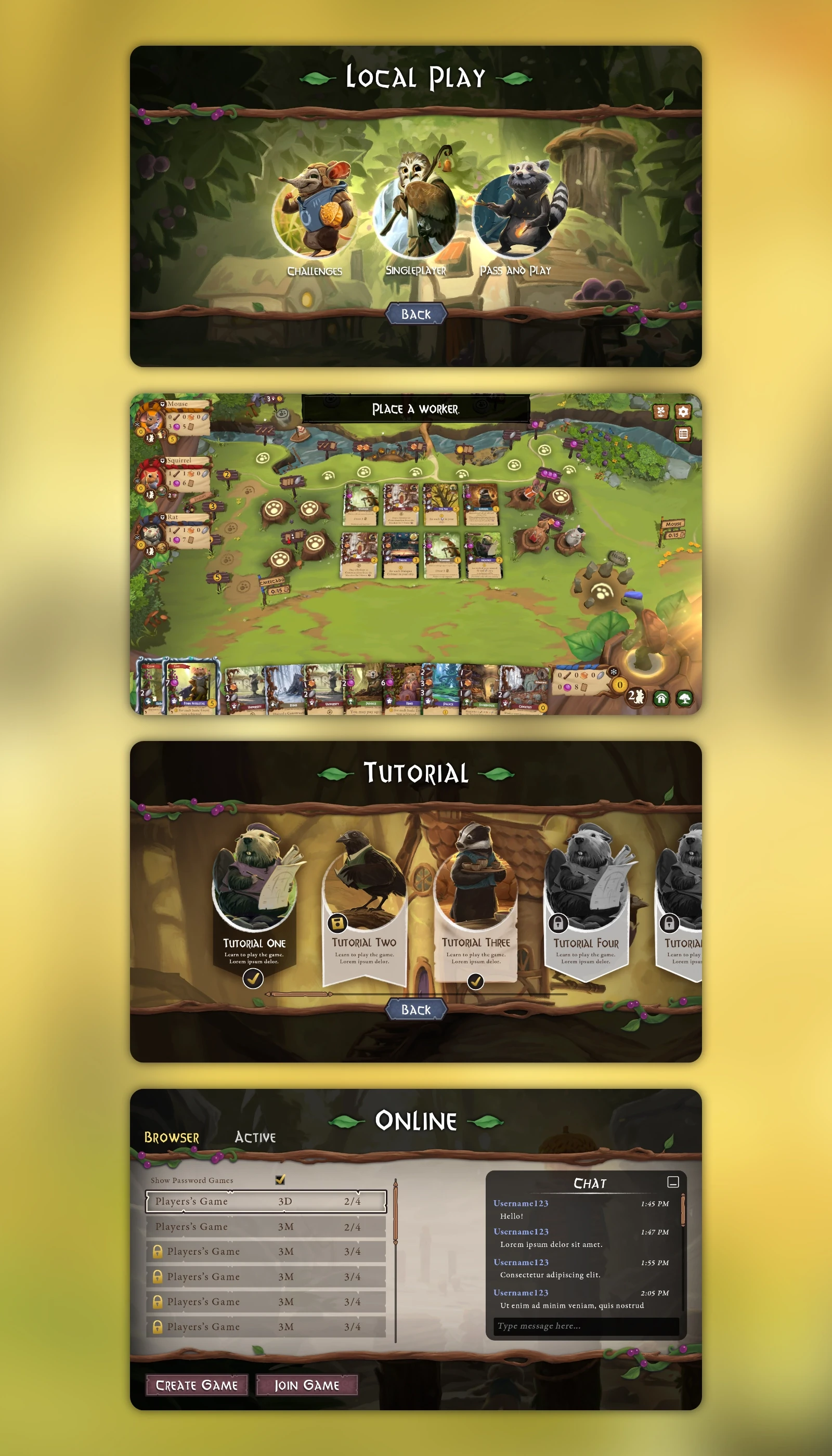
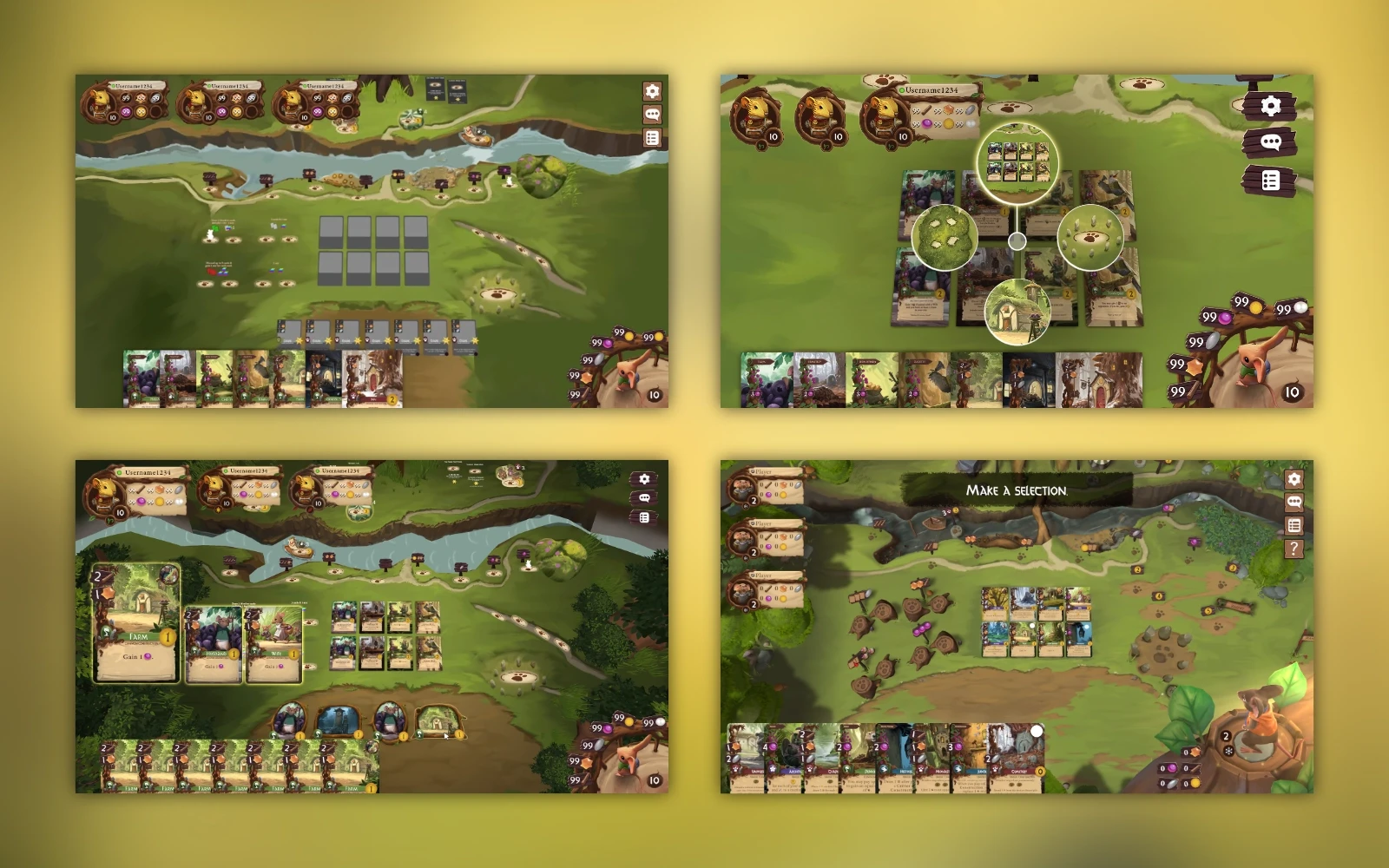
Process
Establishing a Hybrid Visual Language
Maintaining Everdell’s whimsical tone without sacrificing usability required a blended approach to the visual language. I implemented:
Organic 3D shapes to reflect the game’s natural setting
UI components integrated into the environment for thematic cohesion
Clear, structured text and icon layouts for key HUD elements
A neutral supporting palette designed to let the card art remain the visual focus
Prioritizing Readability in a Card-Heavy Game
To accommodate the high number of cards that can appear in a player’s city, I streamlined each card to show only its essential information: a thumbnail, card type, and victory point value. Distinct visual treatments clearly separate city cards from Meadow cards, making them easy to interpret at a glance. A press-and-hold interaction reveals the full card for quick, unobtrusive reference when needed.
Result
Proving That Strong UX and Strong Aesthetics Can Coexist
The final UI strikes a balance between whimsy and usability. Player's have given positive feedback in regards to the experience compared to the physical board game. The UX design has allowed new players to pick up the game more easily as well with guided interactions and clever hinting that is only possible in a digital medium.
The end result is a digital application that feels like Everdell while offering the clarity needed to navigate its rich strategic gameplay.